Sunday, November 30, 2008

Coloring tiny areas with the Copic Original

I recently had the chance to work with the wonderful ladies at A Muse, training them how to get more out of their Copic Original Markers. A Muse makes tiny little stamps of simple images that are perfect for coloring in, but a Super Brush nib on a Sketch is a little tricky for beginning stampers to use for coloring in their tiny stamps. Most A Muse people use the Copic Original, which has some unique coloring techniques compared to the other marker types.

Tips for coloring tiny areas with a Copic Original:
1. If the paper isn't soaked all the way through it's OK. On tiny areas one little stroke is enough for a smooth color. If you try to soak the paper like you do on larger areas it will bleed and feather, so it's OK to not soak.

2. Try not to go back over the area a second time. One stroke is all you get- any more and you risk bleeding.

3. Plan your blends in advance. Remember, you get one stroke, so you can't go light-dark-light on tiny areas without bleeding. See the tips for blending later in this post.

4. Work slowly but cleanly. You can erase mistakes using your colorless blender, but it's harder to get it perfect on tiny images.

5. Don't scrub over the lines. Although you're not soaking the paper as much, the fine point on a Copic marker is firm and if you press hard it has the potential to pick up your ink more than the soft brush on a Sketch or Ciao.

6. Color in circles keeping all your edges wet. You can get streaks in larger areas if you don't keep your paper damp, so be aware.

7. Practice makes perfect. You might not get it right the first time, but keep trying. Also, when you find a technique that works, WRITE IT DOWN and add it to your example book.

Basic Coloring of small areas
For my first example I colored this little mermaid. She's stamped with the new A Muse Dye ink pad, though I stamped it twice so I could get a nice soft gray value.

I colored the base color of E00 for skin and BG10 for her tail then let it dry completely. This allows me to add a second color without running as much of a risk for bleeding. Then I carefully came in and added one tiny stripe of darker colors for shadows. Last I added a few dots on her scales with the darker BG45.

With this technique notice how all my color edges are crisp with no blends. This is usually easiest on small areas. Also, I didn't scan it in, but the color on her arms didn't make it all the way through to the backside, and that's OK because it looks fine on the front and I'm not blending in any other colors.

Blending Techniques on small areas
For long, narrow areas that you really only have one stroke on, your best bet will be either using the Tip to Tip blending technique or the Palette Blending technique. Both of these take practice. You'll have to do a bit of trial and error until you figure out just the right amount of color that you've picked up on the tip of your marker. These techniques work better when you have a light colored marker and you add dark to the tip.

For this image I used the A Muse Birdhouse stamp. I colored in a streaky manner the main house area, then added some E49 to the tip of my fine end of the E55. Then I streaked in the darker color to accent the wood grain.

If you want something to fade to white, use the colorless blender and pick up your color onto it. Remember to clean the tip after adding second colors- it won't ruin the tip but the next time you color it may have a tiny color residue that ruins your creation.

Why didn't I just add the E49 directly to the picture? E49 is way too dark for E55, and it's in a different blending group. By adding it to the tip of the E55 it mixes better with the E55, so it lightens up and it looks good with the lighter brown. It's easier to get a softer feel with the grains fading out without having to blend them out. Notice on the narrow strips for teh birdhouse I added E49 to the tip of the E55 and put one stroke down. Even on the narrow areas it looks like a smooth blend though it's so tiny.

Stamp inks
Also, you may have noticed that I'm using a different ink than usual- A Muse has a new dye stamp pad that works GREAT with Copic markers. I've been testing and using it and I am very pleased. Sometime in December I'm going to run another survey of favorite Paper and Ink combos for stamping, so if you run across a new winner, keep it in mind and save it for the contest.
Saturday, November 29, 2008

Multiliner Prize Winner

I hope everyone has had a great week. I've been so busy and overwhelmed that I really haven't posted new techniques this week. For that I apologize. I would like to share some details soon about coloring small areas now that we've talked about coloring large areas. If there is something specific you're struggling with coloring, just let me know, and I'll try to help.

Meanwhile, Here's the winner for the fun Thanksgiving blog giveaway. There were 112 comments, and our winning number is:

Random Integer Generator

Here are your random numbers:

91 

Timestamp: 2008-11-29 07:59:57 UTC


Who happens to be Jodi. Congratulations to Jodi! She won the Thanksgiving prize of a 0.03 mm Multiliner and other Copic goodies.

Blogger Jodi said...

You are just amazing with your drawing and such! The multiliner would be a great help when a stamp doesn't stamp correctly or if I want to add a little detail to a stamp. Have a wonderful Thanksgiving!

I hope you enjoy that fine lining pen for fixing mistakes and adding cool details. Be looking for more fun Copic prizes on a regular basis. Meanwhile, keep coloring and I'll be posting some more useful techniques next week.

Also for those of you in LA and San Diego, I'll see you next weekend!

Tuesday, November 25, 2008

Working with the 0.03 multiliner

This week here in America is Thanksgiving. There are many things I'm thankful for in this world, but I'd have to say that besides my family, I am happy to work for a company that has high quality art supplies that I love using every day. They feed my creativity. This month, 8 years ago I first met with the fearless leaders here at Copic and made a brochure for them. So in honor of my Anniversary of working at Copic and because I want to share with everyone I am offering a prize. Post a comment on today's blog and you will win a Multiliner 0.03, and also get a chance to win other fun Copic products.

0.03 mm Multiliner
One of the unique tools Copic makes is the finest point sized inking pen in the world, the 0.03 mm Multiliners or Multiliner SP's. If you've ever tried them, they take a very delicate hand. These are a high-quality art supply that is a joy to use.

As you can see from this comparison, this is one fine line. Look at how chunky the 0.3 pen looks compared to the fine delicacy of the 0.03. These are not for the heavy handed artist.

So what should they be used for?
I use them for fine cross hatching or drawing hair.

Stampers use them for adding details to stamped images.

Calligraphers use them for micro-writing competitions.

What you probably shouldn't use them for: Writing a check (my husband figured that one out for me). If you have a heavy hand and break even the strongest of tips, then this pen should be avoided. If you are heavy handed and want a fine pen then go for the 0.1 mm or 0.2 mm pens.

Prizes
What do you use these tiny pens for? What would you use it for if you had one? Leave a comment with your answer. The winner of this blog candy will receive a free Multiliner 0.03 with some other neat goodies, so leave your comment with e-mail address on today's post and we'll draw a winner on Friday!

For the final image today I drew on this little, mini domino with the 0.03 mm Multiliner. Once I'm done, I need to heat set it, then ideally coat it with something to seal in the multiliner. As you can see from the penny, this is one tiny little piece of work (can you solve the maze?). Happy Turkey week! Marianne

Note: Congrats to V! She figured out the trick to my tiny maze - it goes in one side and out the same side. Mazes are one of my favorite things to draw, and I like to make them a little different each time.

Monday, November 24, 2008

Coloring large areas, Part 4-Removing Streaks

To conclude coloring large areas for a while, let's combine a couple of the techniques I talked about last week. Remember, as you find things that work, WRITE IT DOWN with an example so you don't forget.

When you are coloring a large area that is already streaky, your best bet to fix it is to color over it. However, if the area is already dry you may still see streaks unless you are smooth an even and soak the paper extra well.

On areas that are already colored and dry, remember this when coloring over it.

• If you use the same color your picture will get one shade darker

• If you color over it with the colorless blender it will get lighter

• If you color it with a color from a different family the tone will change (this might be a good thing if your original color just wasn't quite what you need).

• If you use a color that is one or two shades LIGHTER than the original color, then it will smooth out to being very close to the color you desire

If you look at these examples you can see exactly what I'm referring to. The streaky E31 just looks bad, but I have to very carefully choose the right color to get it to look correct but not too light or dark. Notice how by adding E40, while it's close to E31, it's not the same color family, and therefor adds some gray. E30, by being a shade lighter in the color family keeps the blob similar in feel without getting too dark.

Here is a larger example of this in progress. Notice how the streaky background has darker edges in a grayish BG. My overall color is BG11 though, so I'm going to color over the whole thing with a nice juicy BG10. I color very slowly and soak the paper even more than regular since I need to blend my ugly streaks in. Yes, the picture got darker, but unless I add blender in, this is the lightest shade in this blending family.

After I layered on the BG10, I came back, touched up the darker BG93 (I didn't mind that the edges got darker). Now my whole picture looks nice and smooth, no streaks.

Amateurs vs. Professionals
I like to say, the only difference between Amateurs and Professionals is how well they hide their mistakes. Other people say "They're not mistakes, just opportunities."

My last example today is the last resort. If you just can't get rid of the streaks, then hide them in other ways. Make a mottled background like you see here by dotting on some color. Or, I showed how you can make a neat pattern by soaking an old, nasty rag in blender and dabbing it on. Either way is great for covering up the pesky streaks. I think I like this background a lot. Have a great day!

Thursday, November 20, 2008

December classes in So. Cal

This just in, for those of you in LA or San Diego, CA I will be teaching a series of papercrafting classes and Make-it-Take-its in early December. These classes are all beginner Copic coloring and are going to be in conjunction with Our Craft Lounge stamps. Here are the locations and times. There may be two other locations, so stay tuned. These are open to the public, and we look forward to seeing you there!

Friday,12/5/08:
2-4-Paper Tales-Make It, Take It
3960 W. Point Loma Blvd.
San Diego, Ca. 92110
619-222-2510

6-8-Jazi Crafts-Make It, Take It
4747 Oceanside Blvd.
Oceanside, Ca. 92056
760-414-9645

Saturday, 12/6/08
4-6pm
Tall Mouse-class
17506 Yorba Linda Blvd.
Yorba Linda, Ca. 92886
714-996-0101
Please call seats are limited
Food and prizes

8-10pm
Scraparazzi-Make It, Take It
6738 Bright Ave.
Whittier, Ca. 90601
562-907-0083

Sunday, 12/7/08
11:30-1:30
Stampin EJ @ Debra's Cottage-Make It, Take It
277 Bristol St.
Costa Mesa, Ca. 92626
949-362-0697

Fixing old streaks

It's been busy for me this week. Last night I had the chance to teach a wonderful group of mostly Architecture students basic marker techniques. Today, if you are in town you can stop by the U of O Bookstore and see the Copic demos from 10am until 6pm.

Meanwhile, here is a quick tip to build on the last post. If have old artwork that you colored with Copics and you want to clean up an area the first step I mentioned is to figure out what color you used originally. Once you've figured it out, or are really close, the next step is to go back over your artwork to smooth it up.

Smoothing Old Artwork without changing the color
If you take the exact color you used before and go over your work to smooth it up it will get too dark. Likewise, if you color over old, streaky areas with the colorless blender it will get much lighter. The trick is to:

1. Find a marker that is about 2 shades lighter than your original streaky area to color with.
2. Start from one side, color smoothly and evenly in little juicy circles, keep all your edges wet and it will re-wet the old color, mix in with the new color, and with enough juice it will cover up and blend away the old streaks.
3. Don't let any edge get dry or else you'll add more streaks in. Also, it might take a bit of effort to get rid of really bad old streaks, so try this technique a few times over the same area if it doesn't work the first time.

I am not showing artwork today because in my next post I'm going to build on this idea and how to apply it into more techniques for coloring backgrounds. Have a great day and come visit me if you're in the area.

Tuesday, November 18, 2008

What Color did I use?

Before I get into the next background technique I wanted to touch breifly on something that may help many of you. You're digging through old artwork and you come across one that was colored with markers a while ago. Looking back at it now you think, "Wow. I really did a bad job coloring. I wish I could fix it."

You can! I mentioned a while ago that you can come back at any time and re-work old pictures. I briefly mentioned my method but I want to cover it in depth so I can build on it later. The first question to ask is-

What color did I use?
Hopefully you were good and you wrote down what you used. Build good habits now and it will help you in the future.

Plan ahead - Write it down
If you find yourself always looking at something and wondering what colors that you used then you should probably write them down. It's been a while since I plugged keeping an example book or a swatch book, so I'm going to remind you again- Keep a book with color combos you like / don't like. You'll never remember them all. As an artist that scans in all my work I can just write things off to the side so it's always there. I've talked to stampers who get into the habit of always stamping two copies- one for their project and if it comes out good then they color a second copy to keep in their example book.

A simple way to know your colors is to write it lightly on the back of your picture with a pencil. That way it won't detract from the beauty of the front. Especially if you're coloring a large stack of pictures and you have to stop in the middle- you'll know what the last color you used was.

Then, I keep two separate example books for papercrafting (my other example books are broken down by category- Fine Art, Manga, or Blog). I have one book with just techniques and one book filled with color combos. Next to each picture I wrote down what works or not so I don't forget (these Jeans are original art, not a stamp).

Example books for teachers or stores
For those of you who teach workshops, having little example books is invaluable. Class participants can flip through and get ideas or "recipies" on how you made a picture look the way it does. Then, if you find them always asking "oooh, how did you do this one?" you have a good idea of what to cover in your next workshop. I can't tell you how many times people have asked if they could take photos of my example books so they can remember a technique. If you make one yourself then you'll remember better what you did to get that look.

For store owners, having a simple technique or color combo book next to your display is a great way to help people who come into the store get more ideas on how to use the markers. These books don't have to be elaborate- just a few examples held together with a ring is usually enough, though more detailed books are inviting too. Whatever you make, make sure it's attached, since these have a tendency to wander off when you're not looking.

I forgot what color I used
For the pictures that you forgot the colors you used here are a few solutions.

1. Trial and error. On a similar paper scribble a bit and see what color it could be. In many cases I layered colors so I don't know what I used. When you test, test with a single swatch and test with an area you colored twice. This helps you know the range of one marker color, from it's lightest to it's darkest value. Then hold up your swatch and hopefully you'll find a match.

2. Use a hand-color chart. I know I've mentioned before, but if you haven't already started your own color chart, you should do so now. Go to the Copic Library and download our chart. Print this on the paper you use most frequently so your colors are most accurate. Then fill in what colors you have. That way you know.

Karen Lockhart, of Lockhart Stamp Co, took her large color chart and punched a tiny hole through each color so she can easily match up Copic colors with papers, old artwork, or whatever she needs to match. Some people make their own spreadsheets in a format that is easy to line up to get an exact match.

Secondary Color Chart
I say take this another step. Make a secondary color chart with your favorite blends. All on a clean sheet of your favorite paper, in a list, as easy as the main chart. Then you have a quick reference (papercrafters- you should make your own charts using your favorite ink colors and paper combos, or you can just use my chart).

Remember when I show you a color spotlight and I show little blended swatches? Here's your chance to do the same. I made you a blank chart you can use and share. This is half-page size, so you can get two on a page when you copy it or scale it to whatever size works best for you.

To use this chart-
1. Print copies on your favorite paper. For best results make these on a laser printer or from a regular photcopier, unless you know that your printer's ink will not bleed with Copic Markers.
2. Fill in the color family at the top. For instance, Y or E
3. For each row of swatches, start on the left with your base color. In the following boxes make your blends. I included 3 spaces under each box. You can make two or 3 color blends, just write them down!

Don't think that you should only do the Natural Blends for each color. This is your chance to experiment with odd combos (Or check the sidebar for people like Debbie or Sharon who have their favorite combos listed). For the really dedicated user, you may wish to have a different chart for each color you own. With 322 colors, you can see that the colors to blend are limitless. Just be warned, your book of these combos might get pretty big.

Care for a hand-color chart
Be careful where you store your hand-color charts. When you're not using it, tuck it away out of the light. This keeps the dye from fading and your chart will last a long time. Our warehouse keeps a hand-colored chart out in the open since they need it so often. It needs to be replaced each year, since the palest colors fade from the lighting. If you need to have a color chart out in easy sight, put it in something that will protect it from the UV rays.

It's getting late, so I think I'd better stop for the night. This wasn't the exact direction I was planning on going, but I feel that organizing your colors can help you with your creative process. Have a great day!

Monday, November 17, 2008

Coloring large areas, Part 3- Blender Pre-soaking

Hope you had a great weekend. I want to do a few more posts on smooth backgrounds before I get into some other techniques and topics. Hopefully you have had a chance to practice what we've already covered.

Pre-Soaking backgrounds with the blender
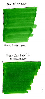
Today's background technique is very straight forward. This is a good technique if you are covering a REALLY large area, like for architects using wide markers, though I am showing it with the chisel end of regular Copic markers.

I colored in streaks to really show the smoothness difference between the blender and the paper that wasn't pre-soaked (if I colored in circles it would be totally smooth. This way was easier for me to tell that I was putting down exactly the same amount of ink between the two samples)

For a smooth, even background you can get a really juicy blender marker and pre-soak the area you want colored (I inked my blender just before doing this to make sure it was good and juicy). Stay inside the lines. While the area is still damp, add your background color. Very simple, very easy.

You may not be able to see it very well, but on my pre-soaked sample of green it goes outside the lines at the top a bit. This is because I accidentally went outside the lines with my blender, so my color wants to follow wherever the blender is. Also note, that the color is slightly different between my two greens. This is becuase it takes less ink to evenly color your paper when you pre-soak it. The backside also looks different, with the top example looking streaky but the bottom example is smooth but grainy, not perfectly smooth like it usually looks when I color regularly.

The trick is to color while the background is still EVENLY damp (that's why it's so important to have a juicy blender). It takes practice to work quickly but smoothly before the base blender dries. Once the large area is done then go back and do the tiny areas. Remember to add blender to tiny areas as well, or else the color will be darker and look bad.

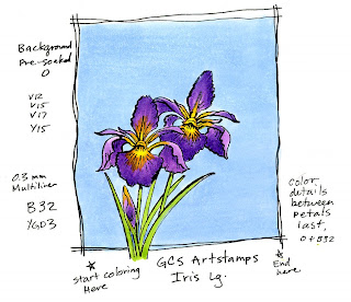
For my final example today I took this beautiful large iris by GCS Artstamps and I drew a box around it for my sky. You can see where I started (so my hand didn't drag through the wet area). and how I worked my way up, across, and then back down. I could have worked a little faster, as it is you can see how the side I ended on looks a little different than the other side. Hope this helps give you some good ideas about backgrounding, I'll have a few more ideas later this week.

Thank you again to everyone who wished me and my friends at Our Craft Lounge good luck on our new company. It's a lot of hard work, but it's worth it when people get to enjoy coloring new pictures.

Image: Iris lg. by GCS Artstamps Ink: Tsukineko Memento Tuxedo Black Paper: Copic sketchbook paper

Friday, November 14, 2008

A little announcement...

I've been a freelance illustrator for well over a decade and have worked with Copic now for 8 years. Very few things get me excited anymore about seeing my artwork published, seen, and used. In fact, the last time I got this excited was when Copic called me 6 years ago and offered me a full-time job instead of the freelance I usually do (oh and I have some storyboards that I worked up that are floating around Hollywood right now, but those are top secret so I can't be excited about those).

So what has me so excited? Let me tell you a little story...

Back in April I was getting ready to teach a certification class in Medford, OR. I had been blog hopping and I saw that some sweet papercrafter mentioned driving into Eugene recently. My little gears began turning... hmm, that person lives close to me, I wonder if they would like to come to a class in Medford?

So I e-mailed this person, whose name happens to be Cami. She contacts me and says,
"Why Medford, why not have a class in Eugene?"
"Ummm, OK, but I needed people to attend."
Cami said "How many?"
"I guess if we got 10 people together we could do it."
Cami says, "Give me two days."

I'll be darned, but she had 11 registered in two days and I had to get a location! One of the dear sweet people Cami got to come in for the class was a store from California, called Eclectic Paperie. Joy was her name, and she was such a gem! They both listened so well and paid attention and were excited about every little bit they learned in the class. All of the sweet ladies who attended that class were sooo nice (go visit Cami's blog for more info).

Now mind you, I'm NOT a papercrafter, I'm a graphic designer, artist, and illustrator. At the time of this class I maybe had like 10 stamps in my possession. None of which I really wanted to color on all day during a class (they were too small). To get pictures to color during the class I just dug through my computer and printed up a bunch of line artwork that we could work on.

I have a personal clipart collection that I've drawn over the years that is very extensive (If you can't tell, I draw and color a LOT). The whole class loved coloring my little pictures and I was happy that I got some use out of all that old artwork I had kicking around. Ideas began forming among class attendees...

We colored and Copic'd all day with lots of other fabulous papercrafters. Joy and Cami weren't leaving town for a few days, so the next day I got an e-mail asking if I wanted to get together. Sad to say, I was on kid duty so I invited them over to my place to play while I cleaned :) Within 10 min. they were at my house. For the next 3 hours they sat down and poured through every sketchbook I've drawn in the last 8 years. By the end of the evening they had a plan.

We're going to start a company to turn Marianne's artwork into stamps.

And so, after many months of hard work, rough ideas, and late nights drawing, may I introduce


There's a whole fabulous team, not just the three of us (we can't forget Kimberley!!). It's a company created by stampers, for stampers, and gives me a way to share all the artwork that I draw with everyone so they can have fun coloring it themselves :). OCL will have lots of other great papercrafting supplies and are expanding every day the cool things they offer.

My personal goal is to draw a little bit of everything. If you notice in the first release and with each release there is a variety of artwork and styles. That's because I like to draw a LOT. And I like to draw EVERYTHING. So those of you who have bugged me since I started this blog that I need to turn my artwork into stamps, I have listened, and I was way ahead of you.

What does this have to do with Copic?
Nothing. I still work for Copic, but OCL is my freelance outlet. Nothing on this blog will change. I'll still share coloring techniques using an unbiased mix of my own artwork and stamps from a variety of companies. Just know that if you are interested in coloring MY pictures yourself you now have a way to get them :). As a representative of Copic my goal is to teach EVERYONE to color anything (oh I almost forgot, I need to post more car designs and architecture since those people need pointers as well as papercrafters...so much to draw, so few colors :).

Stamping
However, because of the new company I had to make a card. Here is my version of the Anna Mae stamp set. She's patterned after my own little AnnaMae, with her little blond curls that flip up at the ends. I turned her upside down, stamped each leg individually so she can be doing a handstand, and doodled on the dress pattern with a 0.1 mm multiliner that matches the tissue paper. She's colored with BG11, R81, R30, Y21, E50, E11, BV02, and E31. I added little bling rhinestones and colored the white silk ribbon with my BV02 marker so it matches. I attached the ribbon with a white brad and smile happily hangs off that ribbon.

If you get a chance, please stop by and check out the cool things at OCL. Also check out the great artwork posted by the ladies who have been working all week on sneak peeks.

Have a great weekend and enjoy those new stamps! I'll continue next week with my posts on coloring large areas.


Thursday, November 13, 2008

Coloring large areas, Part 2- Basic techniques

Yesterday I gave you some ideas on how to prepare to color large areas, today let's get started with the first couple techniques and rules of thumb to keep in mind so you don't get streaks.

Large areas, One color
First, we're going to cover just basic, one color backgrounds in large areas. Just like yesterday, these rules can apply to anything you color, not just large areas but when you are working on large areas these small problems become large ones very quickly.

I don't really know which I prefer doing first, background or details. I guess it depends on the picture. Most of the time I do details first, but really, I should do sky first because I can make more mistakes and hide them easier if I color the sky first. As with anything, this takes practice. A lot of people say that they color largest areas first, then work to the details. Other people have said that it's best to start with things far away and work your way closer. With either of those rules, the sky would win as the first thing to color, since it is far away and large.


1. Start at one edge. I am right handed, so I always start on the left and work right. That way my hand isn't dragging through my wet ink. Also, I usually start at either the top or the bottom (it depends on the image) and work my way across. I try to keep details last.

2. Keep all your edges wet. Whenever you get a dry edge is when you'll see streaks, so try not to let an edge dry by constantly going back over colored edges and evenly soaking them. Depending on your paper, you'll be able to tell what is too large an area to keep wet before you can get back to it. Try to color in a pattern that leaves the fewest edges to keep wet.

3. Work quickly and evenly. If you start out soaking the paper, then keep evenly soaking the paper all the way across. Any place that you change your technique will show up and look bad, particularly if there isn't as much ink in some areas as there is in others.

4. DON'T STOP. Even if you make a tiny mistake, keep going so the whole thing doesn't look bad. So what if you go over the lines a little bit? If you are working with a light blue and you accidentally color over the tops of the grass it really doesn't matter, since light blue is in green and you can color over it.

5. If you leave streaks, leave them in a natural direction. In a sky it would be OK to see horizontal streaks more than streaks that run up and down or diagonal. Also, in a sky if you leave streaks, try to be consistent and make them look like they were supposed to be there. Don't change direction of your stroke in the middle of your artwork.

6. If you must let an edge dry, make the edge soft. Sometimes your work is so large that there's no getting around it drying somewhere as you work around the side of another shape. In this case, feather out that edge instead of leaving a hard line. It's easier to smoothly come back to that spot later if you're not having to re-wet a crisp edge. You can feather the same color back in from the other direction once you finished your large area.

Here is a diagram of how I colored yesterday's sky. I started at the left (1) and colored at a horizontal angle down and to the right. This felt more natural to my hand. I colored in small circles with the chisel end of my marker (because it's larger), keeping all my edges wet and juicy.

When I got to the man (2) I colored the smaller side first and quickly so the other side wouldn't dry. (3) Then I quickly came back and finished the rest of the picture. I wasn't too careful about the water line, since I knew that the water was going to be blue anyways, but I tried to stay out of the grass as much as possible.

With Practice you will find a method to your coloring. It also helps if you turn your artwork so the strokes flow with the direction your hand most easily moves. For this piece I had the artwork turned sideways because my hand flows smoother that way.

For my final artwork today I'm working on the large Lavender Flower Fairy by Stamps Happen. My sky is BG10, one of my favorite sky colors. Because the fairy is interrupting the big blue sky, I start in the bottom left corner and work my way around. Then I come back and work from the middle, then the bottom right side of the tall stalk. You can't see the next step, but because the lavender at the bottom is hard to distinguish from the sky, I just colored my sky right over the top (since blue is part of green). Notice also that I feathered in some BG93 along the bottom to give the sky around the lavender a bit of depth.

Then I finished up the sky by cleaning up my mistakes with the colorless blender and coloring in all the details last. I hope this inspires you to try coloring in larger areas and practice some of my techniques. I'll have a few more posts about coloring large areas, with other methods and tools, so stay tuned. Paper: Copic Sketchbook paper Ink: memento tuxedo black Image: Lavender Flower Fairy by Stamps Happen

Wednesday, November 12, 2008

Coloring large areas, Part 1- Before you start

I'm back! What a great trip I had visiting with so many fabulous papercrafters, designers, stores, and companies. This was my first visit to Canada in at least 15 years, and the weather was perfect (for those of us who live in the wet Northwest and are used to rain, clouds, and the occasional dry moment). There were so many fabulous papercrafters I met with that I can't name them all, but be sure to check Sherrie's blog, since she'll be posting a chance to win goodies sometime soon.

First of all, I want to apologize that the artwork on my auto-post on Friday didn't download. I don't know what's wrong, but I'm going to try and find the original file and fix it soon.

Coloring large areas
Today I want to start on the first part of a couple posts on smoothly coloring larger areas (larger than 3" x 3"). There are a few ways of doing this, some will work better for you than others, and some will be easier for blending than others as well. Before you even get into coloring there are a few things to consider to make sure that your picture is smooth from start to finish.

Whenever you color you should consider these suggestions. Get in the habit of being prepared so that you get the best coloring, no matter what size your area. Tomorrow I'll get into methods and techniques, but I'm purposefully trying to keep my posts bite-sized so they're easier to digest.

Things to keep in mind before coloring a large area.
These tips are good when coloring any picture, but particularly when you are coloring larger areas these mistakes will really catch up with you.

1. Make sure you have clean, even scratch paper under your work. This seems like an obvious thing, but if you have an edge from scratch paper under your coloring area it may cause you to get streaks and un-even coloring. Also, if your scratch paper is dirty it will pick up color and ruin your work.

2. Juicy markers work better. If you're doing a background with your favorite light blue marker that you use all the time you may want to fill 'er up before you start coloring (don't overfill). It would be really bad if it runs out half-way through your work and you have to stop and refill.

3. Thinner paper is easier. When you have to color a large area evenly you will need to work fast. Thick paper like PaperTrey Ink's Stamper Select or some bristol boards are so thick that to evenly color and smoothly saturate the paper you have to color slower. Slow coloring on large areas causes streaks. Copic has a new prototype stamping paper coming out soon- it's thinner than stampers are used to but heavier than regular paper (about a 40 or 50 lb. paper). You wouldn't make your base card out of it, but because it is thinner it takes less ink to soak. I'll do a full review soon after I get more feedback on it.
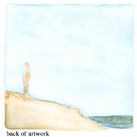
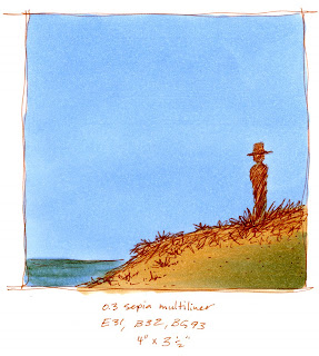
Why architects and designers like Alcohol Marker paper is because it is very thin. It takes very little ink to get a smooth large area colored. Too bad those papers are coated so they don't give you easy special effects like I prefer.

4. Don't touch the paper. What do you mean, Why shouldn't I touch it? Before you color a large area put down the potato chips, make sure your hands are clean, and try not to touch the large area you're coloring with your greasy fingers. On some papers you'll end up seeing the fingerprints, so try to hold the paper on it's edges or make sure your hands are clean and dry. Likewise, try not to rest the sides of your hand directly on the paper, put a napkin or something under your hand so it doesn't smear.

5. Make sure your work area is clear of things your arm may bump into. Also make sure no one is going to distract you. I can't tell you how many times I've had to tell someone "Wait, I need to finish this area first or else it will look bad." Usually they look at me like I'm crazy obsessed over my pictures, but really, if you have something in your way that you need to move or someone comes and bugs you it will slow down your coloring and then you risk streaks.

Here is my final piece today- it's a solid bright blue sky with the silhouette of a man looking at the ocean below. I drew this with a sepia multiliner onto color laser copier paper (very thin) and colored it simply, quickly, and smoothly to show how even you can make large areas. I also included the backside to really show how a smooth picture should look from the back (and because I think the backside looks cool). Just so you know, I didn't photoshop the picture to get rid of streaks either- I just colored smoothly and quickly using one of tomorrow's techniques.

Let me know any of the problems you've encountered when trying to color large areas and I'll try to solve those this week. Have a great day!

Friday, November 7, 2008

How to make a comic


I'm out of town for the weekend, so I figured I'd post a fun old comic I drew a while ago about how to make comics. You may print it out and use it for educational use only. Have a great weekend and I look forward to seeing everyone in the Seattle class today and the Vancouver BC class on Monday.

Thursday, November 6, 2008

Technology can be Useful and Certification

Every now and then computers actually make our lives easier and work in the way that we want them to. Take for instance all of you who e-mail me to get on my mailing lists for classes. Now I have an easier way!

If you look on my blog page you'll see a sign-up for the Copic Mailing List. We finally got this automated system up and running so that I'm not overwhelmed with e-mails about getting on my mailing lists- this simple button will do it for me.

Just so you have all your questions covered-

1. If you already e-mailed me to get on a list you DO NOT need to sign up again through my service. I'm taking care of that.

2. We will not sell your name/e-mail to any other company. That's mean and unethical.

3. By signing up you are saying it's OK for Copic to send you notes about New Products, Upcoming classes, and things like that. We're NOT going to bombard you with junky, annoying e-mails. We WILL occasionally have a survey with a chance to win, so be on the lookout for those.

4. Please sign up through this blog's button.We have a couple places you can sign our mailing list- from this blog, from the Copic homepage, and from the Copic Facebook and Myspace pages. While they all go into our master file, I have the categories set up a little different on the form from my blog. This helps me know my readers a little better. If you do sign up through one of our other forms don't worry, it will go to the same place.

5. On my form I have a special box for Copic Certification e-mails. I ask that if I have a specific location already mentioned write it in. Otherwise, please put your region in this box. When I do send out info on Copic Certification classes I send them out regionally, so everyone within a few states will get the memo. If I don't have a class listed in your area, still put your dream location.

6. Even if you're in another country please fill out this form! Copic markers come from Japan and I work for the North/South American distributor. I have direct contact with Japan and our other counterparts. By signing our mailing list it helps the manufacturer know where our readers are coming from so they can help you better.

Please sign up! It only takes a minute and it helps us help you get more out of your marker experience. Thank you!

As I fly out for Seattle and Vancouver BC today I just wanted to also mention that we have more East Coast Certification Classes coming up in early 2009! These will be taught by our fabulous Papercrafting Design Team member, Sally Lynn MacDonald. She is a very experienced teacher and will also be assisting me at my class prior to Winter CHA. If any of the following locations are interesting to you please sign up for my mailing list! When I get back from this trip I'll be sending out details and applications for my CHA classes and for these other East-Coast locations, so join a mailing list NOW!

On Sally Lynn's blog you can see a list of other potential locations and dates for 2009 as well.

Please remember, Certification classes are open FIRST to Store owners, teachers, and design team members (basically people in the papercrafting industry). If there are any spaces left (usually 2 to 3 weeks prior to the event), then people from the general public are welcome to attend. These classes are technique driven, and each instructor will add their own personal flair to the class. I know that Sally Lynn is a much more experienced papercrafter and scrapbooker than I am so her classes will be jammed full of papercrafting know-how. Since I have a Fine Art background, my classes tend to be a little less industry specific and more product-specifc.

What if I have already taken a Certification Class and I want to take it again?
I usually have a few spaces for people like you in each class. If you haven't already contacted me about this, then here's the scoop:

1. There will be a small fee. This helps us cover catering and room rental, etc.

2. You don't get a new packet unless you want to pay full price. Likewise, no new certificate, sorry.

3. Please let me know at the same time I open registration to everyone that you are a REPEAT. That way I don't figure you into my class size limit the same.

4. When you come, please help the people around you. Especially with those 4 pesky blending techniques. Those slow down the class the most and having someone else at the table who can help is greatly appreciated.

5. Please bring your own markers and have them labeled. It takes me a while to check my classroom marker sets after each class and refill them, which I factor into the class cost.

6. If you can't make it to the whole class, then please enter/exit at the breaks so you're not disrupting me (it's too easy to sidetrack me as you know!)

Otherwise, I look forward to seeing you again and having you help! The few people who have had the chance to repeat the class say that they learn just as much the second time as they do the first (just ask Lori Craig and Sharon Harnist, some of my most recent repeat offenders :).

Meanwhile, I'm heading North. Have a great week!

Wednesday, November 5, 2008

Shadows Part 7- Adding gray to colors

Today I'm adding more to our ongoing discussion about the nature of shadows. To see all parts so far, just click on the "shadows" label at the end of this post. If you didn't read yesterday's post or follow the link to the Gamblin Oil Paints video I really strongly recommend you do so now. I know color theory seems like kind of a drag, but it will help your artwork look better.

Yesterday when I talked about the tone of shadows, I want you to know, there is no right or wrong answer- either shadow works. Art is a matter of personal taste, so if it looks right to you then it's right. If you want to make things that "look right" all the time then go into math :)

About Shadows...
True shadows are about two shades darker of the base color. They are not black- you can still see the color underneath.

However, true shadows also add a hint of gray. Color is how much light is reflected back to the eye, so if some of that light is blocked by a shadow then the color must not be as vibrant.

This expands upon the Natural blending families rule (more so in some color families than others) but it is not quite as straight forward as following a sequence of numbers to do your shadows. Now you're thinking, why did you go through all that effort to teach us to pick markers in groups when we are now going to break those rules??

Look at the series Y11, Y13, Y15, Y17, Y19. All of these are super vibrant yellows. Yes you could color a shirt that would look shaded with these yellows but the difference in a Natural Blending group is the density of dye. Y11 has fewer yellow particles than Y15, and Y15 has fewer than Y19. For most blending groups it's a matter of dye density when you go from digit to digit (this is why you can usually layer a color twice to get it one shade darker)

In real life though, if I were wearing a yellow shirt and you were adding shadows you would be adding gray and denser dye particles. So, you can add believable shadows in a few ways:

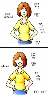
1. Layer on a gray that would go with that color family. In this case Y11 could be shadowed with W's or T's, since all three families are warmish. Keep the last digits the same for light colors or 1-2 shades darker. Test layering the next yellow in the sequence only, layering a gray only, and then layering both for shadows. Which do you think looks better? Remember, it's YOUR artwork, so if you like the look then it works (there are no absolutes with art). By adding gray (W3) and some denser yellow particles from the same family (Y15) it looks more natural.

2. Add gray by moving deeper into the Copic color wheel (the deeper in, the more it gets gray). The next family in is the Y20's, a slightly more muted yellow family. Try layering Y23 or Y28 over your Y11. Now how does it look? For this I added the denser bright yellow (Y15), and then jumped to deep shadows from the next blending group (y28). See how much more vibrant the shadows are? This is because there are so many more yellow particles we add when going with this technique but our gray shift is subtle (from the 10's to the 20's).

My picture is still shadowed more than if I had stayed in the same blending group, but it looks more vibrant than just adding grays. Is is realistic? Not necessarily, since the shadows on a true pale yellow shirt wouldn't add this much orange, but it still looks good in my opinion. If you have enough colors try this on some of your own images. Stick to the same blending group for shadows on one, add shadows with grays to your second picture, then add shadows by jumping to the next blending group on yor third picture. (If you remember my earlier drawings of myself you'll see I look different. This is because I've had a haircut and I've been slowly loosing the baby fat I gained from my last pregnancy. I still haven't grown more fingers though :)

Color Spotlight: Yellows
Yellow is an interesting color in the Copic color world. See on the color wheel how there are no Y90's? The last family is Y30's, and those start moving toward orange. That's because Yellows, as they get more gray quickly turn into brownish colors. Add a hint of red and you're really turning brown or orange. So Y20's are shadows of Y10's, but Y30's are more neutral but they are also the blending group that would pull you into the next color family- YR. When you get into the darker YR's you then get closer to red. (YR07 or 09 and R08 are really close colors). Then you could jump into my post with a color spotlight on YR's.

When I talk about Natural blending families and how they get darker as you go in, 80% of the time this is true (blues, BV's, G's, and BG's are pretty good about following the rules). Some color families don't play by the rules because this is a flat chart for a 3 dimensional concept as I mentioned yesterday and the color wheel pulls you into the next color group as you change blending groups (this is the case on the first families in red, oranges, and yellows- the color wheel pulls Y's into the YR's into the early R's. E's (earth colors) really don't follow the rules because it's easy to take any R, YR, or Y and turn it into browns).

Shadowing with colors beyond the basics
In talking about layering gray over a color to make the shadows more believable, you can add lots of colors to create your shadow that would add denser particles and gray. After watching the color video, what is something you could add to yellow that would cancel it out or make it gray? On a color wheel, that would be the color's opposite or purple.

Many times in fine art you'll see pictures where the shadows have a life of their own, particularly in portraits. This is because the artist is shading their light yellow/peach skin colors with shadows of blue or purple to give the feel of gray without dulling down the vibrancy of their work by just adding neutral grays.

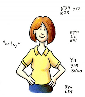
Also, remember that blues and purples are cool colors and shadows tend to be cooler areas on a picture. Here is the final illustration of me, where I used purple as my shadow color and blue to add some extra shadows on my skin. Note that I'm using very pale blues and purples. This allows the yellow to underlay the blue/purple tone and still be visible.

Image: Drawn with a 0.5mm Black Multiliner SP onto color laser copier paper.